

SMS Maintenance Solutions
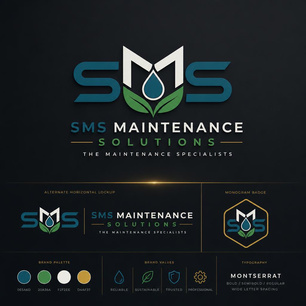
A twenty-year-old trades business needed to look as sharp as its work. We kept the equity in the initials and rebuilt everything else around them.
What we started with.
- 01
The existing mark was a mid-2000s gradient badge that no longer read on trucks, invoices or work-shirts.
- 02
The owner wanted to stay recognisable to long-term clients while pitching to larger commercial contracts.
- 03
Deliverables had to survive embroidery, vehicle vinyl and single-colour print.
How we worked it out.
- 01
Audited every touchpoint the current mark appeared on — uniform, signage, quotes, invoices, socials — to see where it was failing.
- 02
Locked the letterforms first, then designed the container so nothing depended on gradients or fine detail to read.
- 03
Built alt lockups (horizontal, stacked, monogram) so the mark could sit inside any aspect ratio without redrawing.
What shipped.
- 01
A single mark that renders identically at 12mm on a business card and at two metres on a truck panel.
- 02
Complete asset pack delivered in vector, raster and monochrome so the client's printers stopped emailing back with questions.
- Primary logo + monogram
- Horizontal & stacked lockups
- Brand palette + typography spec
- Vector, PNG and single-colour variants
"Very efficient and accommodating. Great attention to detail with a polite and courteous manner."
More from the archive.
Start a
project.
Tell us what you're working on. We'll get back within one business day with next steps.
Get in touch