Coastal Art & Framing
A gallery-quality framer whose original identity read closer to a beachwear label than a fine-art business. We rebuilt around craft, not the coast.
What we started with.
- 01
Move away from surf-shop typography without losing the coastal setting the studio is known for.
- 02
Deliver a mark that would sit comfortably alongside the artwork it was framing, not compete with it.
- 03
Create a monogram compact enough to letterpress into paper wrap and blind-emboss into leather-look sleeves.
How we worked it out.
- 01
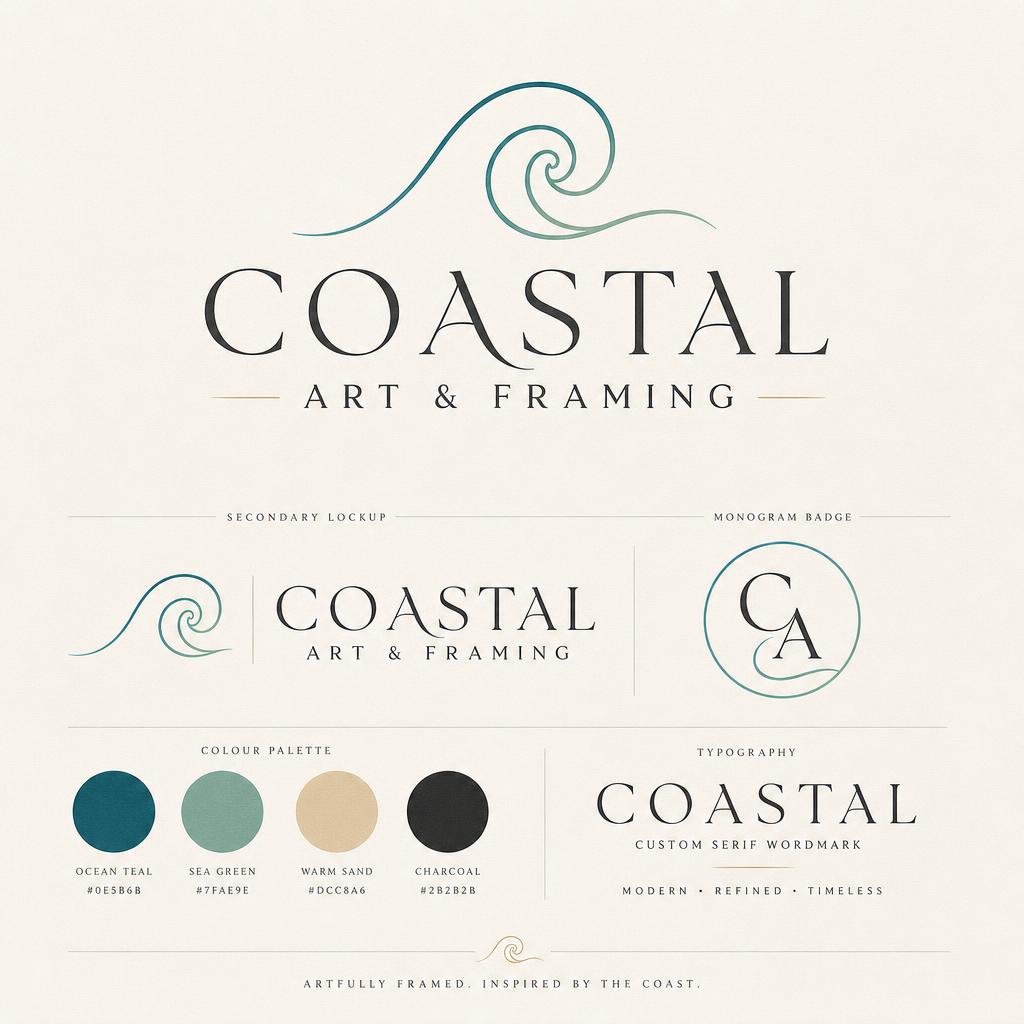
Custom serif wordmark drawn from scratch so no other business shares the letterforms.
- 02
The wave was rebuilt as a single continuous stroke — a nod to a picture-hook profile, not a literal wave.
- 03
Palette pulled from linen matboard, museum-grey backing, and a single warm gold for foil.
What shipped.
- 01
A quiet, editorial identity that lets the framed work do the talking on the studio wall.
- 02
The monogram is now used across paper sleeves, care cards, receipt stamps and vehicle signage.
- Custom serif wordmark
- Wave mark + monogram
- Full brand palette + type system
- Print-ready foil and emboss files
More from the archive.
Start a
project.
Tell us what you're working on. We'll get back within one business day with next steps.
Get in touch