

Head in the Cloud
A brand named around a very literal image — the challenge was to keep the cloud without leaning on the clichés everyone else was already using.
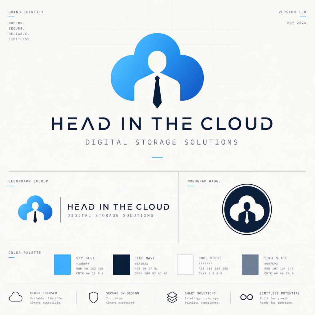
What we started with.
- 01
Deliver a cloud mark that read as considered, not childish.
- 02
Establish a wordmark that could sit on-brand without the cloud when space was tight.
- 03
Colour that felt calm and current, not the default sky-blue reflex.
How we worked it out.
- 01
Rebuilt the cloud as a set of stacked semicircles on a strict geometric grid — one mark, no ambiguity in reproduction.
- 02
Custom geometric sans wordmark drawn to match the arc radii of the mark so the two feel like one system.
- 03
Palette pushed away from sky-blue toward a bone/ink pairing with a muted lavender accent used sparingly.
What shipped.
- 01
A mark that finally looks like a business, not a hobby logo.
- 02
A visual system flexible enough for app icon, deck cover and printed collateral without redraws.
- Primary mark + wordmark lockup
- Standalone wordmark
- Brand palette & type spec
- App icon & favicon variants
More from the archive.
Start a
project.
Tell us what you're working on. We'll get back within one business day with next steps.
Get in touch