Happy Paws
A neighbourhood grooming brand with a warm reputation and a mascot that hadn't kept up. The job: keep the personality, lose the clip-art.
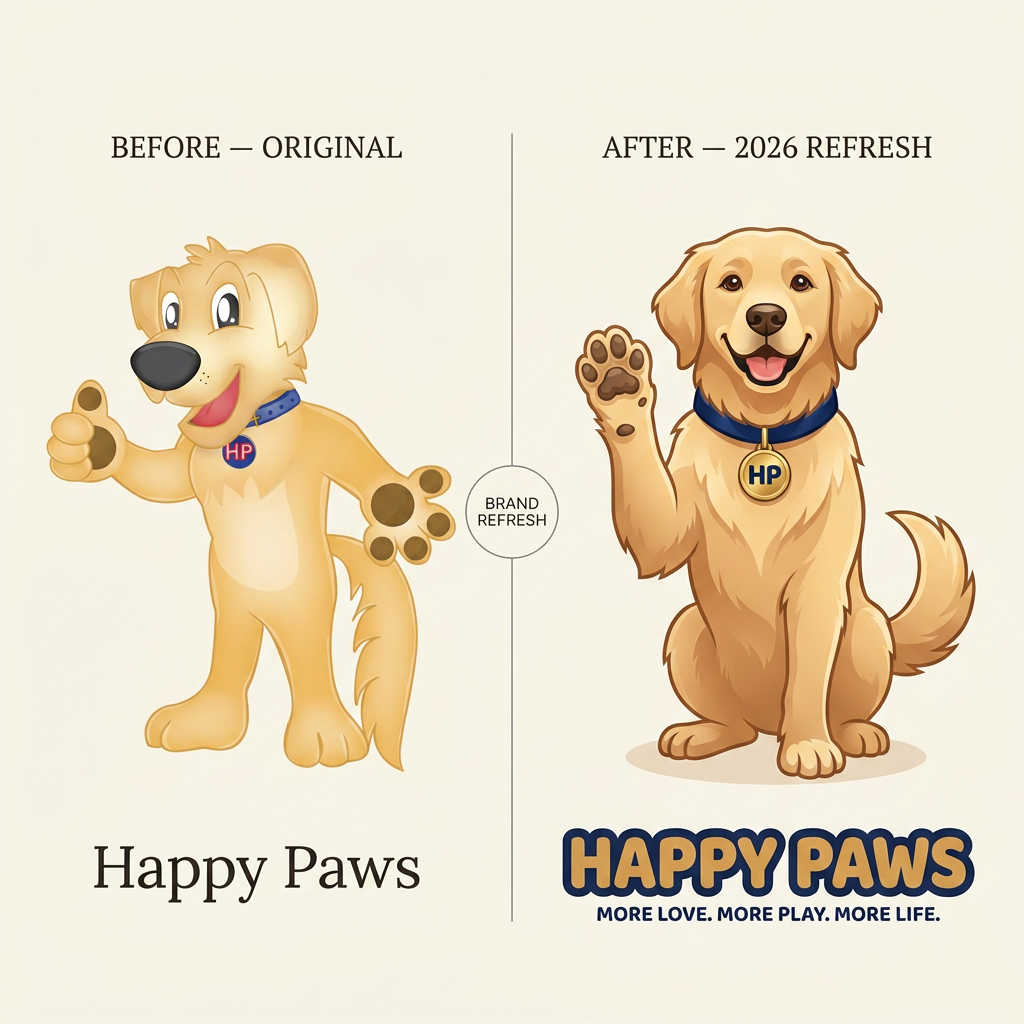
What we started with.
- 01
Refresh the mascot so it felt drawn on purpose, not pulled from a stock library.
- 02
Give the brand a serious badge for van signage and staff shirts alongside the friendlier full mark.
- 03
Colours that photographed well against every coat colour on the grooming table.
How we worked it out.
- 01
Redrew the mascot with a single-weight line so it survives embroidery, screen print and a 32px favicon.
- 02
Built a monogram badge as a second gear — used where the full mascot would feel too playful.
- 03
Palette anchored in warm cream and forest, with a bright accent held back for buttons and CTAs only.
What shipped.
- 01
Same warm personality, sharper execution. Owners regularly get asked who designed the van.
- Mascot illustration + variants
- Wordmark + monogram badge
- Brand palette + usage notes
- Embroidery-ready single-colour files
More from the archive.

Start a
project.
Tell us what you're working on. We'll get back within one business day with next steps.
Get in touch