

Fine Art Solutions
A framing and art-services business trading on reputation but let down by an identity that looked more suburban print-shop than gallery partner.
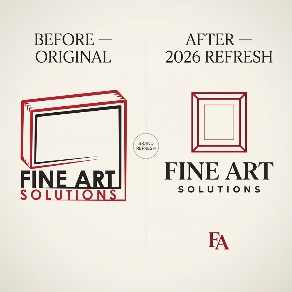
What we started with.
- 01
Lift the identity to sit comfortably next to the galleries the business already services.
- 02
Retain a subtle frame device — the recognisable equity — without keeping the dated execution.
- 03
Deliver a monogram for stamps, care cards and van signage.
How we worked it out.
- 01
Redrew the frame device as a single hairline — a whisper of the old mark, not a shout.
- 02
Editorial serif wordmark set with generous letter spacing so it reads as gallery signage, not shopfront vinyl.
- 03
Monogram built from the same hairline weight so it disappears into a stamp or embosses cleanly.
What shipped.
- 01
An identity gallery partners are happy to co-brand with — a business result, not a design result.
- 02
Full asset pack in monochrome so signage suppliers, stamp makers and printers all match on the first try.
- Primary mark + wordmark
- Monogram & stamp variants
- Brand palette + type spec
- Signage & vehicle-ready files
More from the archive.
Start a
project.
Tell us what you're working on. We'll get back within one business day with next steps.
Get in touch