

Business Card Suite
The brief was 'a business card that doesn't get thrown out'. We treated the card as an object first and a piece of print second.
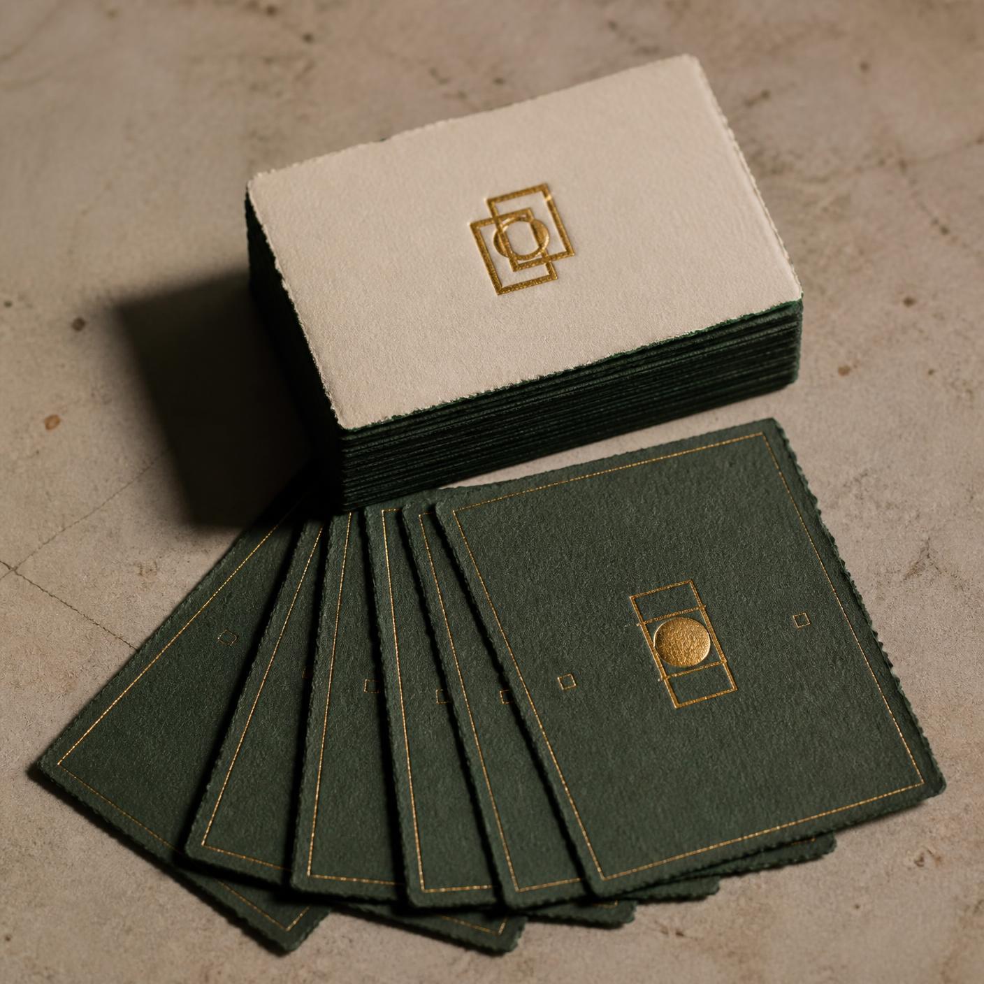
What we started with.
- 01
The card had to communicate seniority without sliding into try-hard.
- 02
The recipient list included finance, hospitality and creative — the card needed to read the room in all three.
- 03
Client wanted a version they could hand out and a version they could send as a small gift.
How we worked it out.
- 01
Specified a 600gsm duplex stock in bone and ink with an edge paint in the brand's accent colour.
- 02
Kept the front near-empty — just the monogram foil-stamped — so the object does the introduction before the name.
- 03
The back holds contact information set in a single line of monospaced type — the whole card reads like a caption to itself.
What shipped.
- 01
Cards that clients photograph and post to their own feeds — free distribution the client didn't have to prompt.
- 02
A print spec tight enough that reprints from any local supplier match the original run without a proof round.
- Front & back artwork
- Foil, edge paint & stock spec
- Print supplier brief
- Alt versions for name changes
More from the archive.

Start a
project.
Tell us what you're working on. We'll get back within one business day with next steps.
Get in touch